Let's Get Visual
 

The World's Greatest Escapes

A set of three non-fiction book jackets of events in history and the present where people had to escape their homes in order to survive and/or find freedom. To visually portray this there was a focus on the form of transportation victims in the book take to escape. For Heaven’s Border they often times swim through the Yalu river to China, Kinder Transport they speed away in train carts, and for Underground Railroad, they travel by foot. However, by just showing the way of transportation it wouldn’t reach the viewer on a deep conceptual level. To enhance it conceptually the decision was made to construct the way of transportation out of what’s needed for them to escape. Heaven’s Border relies on the escapees to financially be able to hire a broker, so the Yalu river was constructed out of North Korean currency. During the Kinder Transport the children needed a passport to travel out of Germany, so the train carts were constructed out of photographs of the victims’ passports. And finally The underground railroad, which was different because there wasn’t a direct form of transportation other than their feet, this lead to the southern states being constructed out of photographs of the slave markets, the thing they were trying to escape.

To completely tie these three books into one series the same stylized text was used. For each jacket the same wear and tear that would have applied to the individuals that went through the events occurred to the text. For example, Heaven’s Border required swimming so the text is wet. For Kinder Transport the children sped away so the text is fading away and for the Underground Railroad, their feet were worn from all the miles so the text looked dirty and worn.

 
Spinewokring.jpg
HB_Front Agnle.jpg
HB_open.jpg
ALL_PRINT2.jpg
KT_Jpeg3.jpg
UR_open.jpg
All Jackets.jpg
 

Tropics Country Club

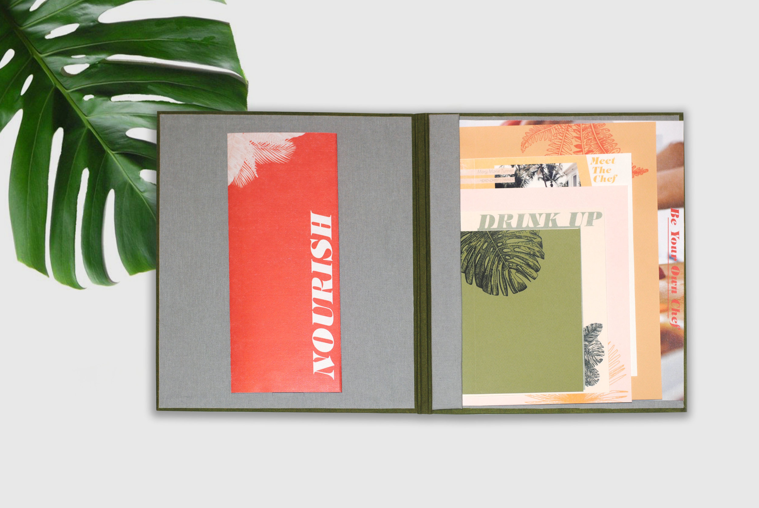
Tropics Country Club is a healthy buddha bowl restaurant in the South Beach neighborhood of Miami, Florida. To conceptualize for the restaurant, the idea of connecting the healthy high-end meals served at the restaurant to the to the idea of the elite class. This idea further developed into the restaurant taking on the setting of an elite country club, with its guests being the members. The purpose of doing so was to show the customers that they too could feel and eat like the individuals living an elite prestigious lifestyle. From this the identity of the restaurant was formed, Topics Country Club. The name tied the conceptual side of the restaurant reinforced the thought of feel elite, eat elite. 

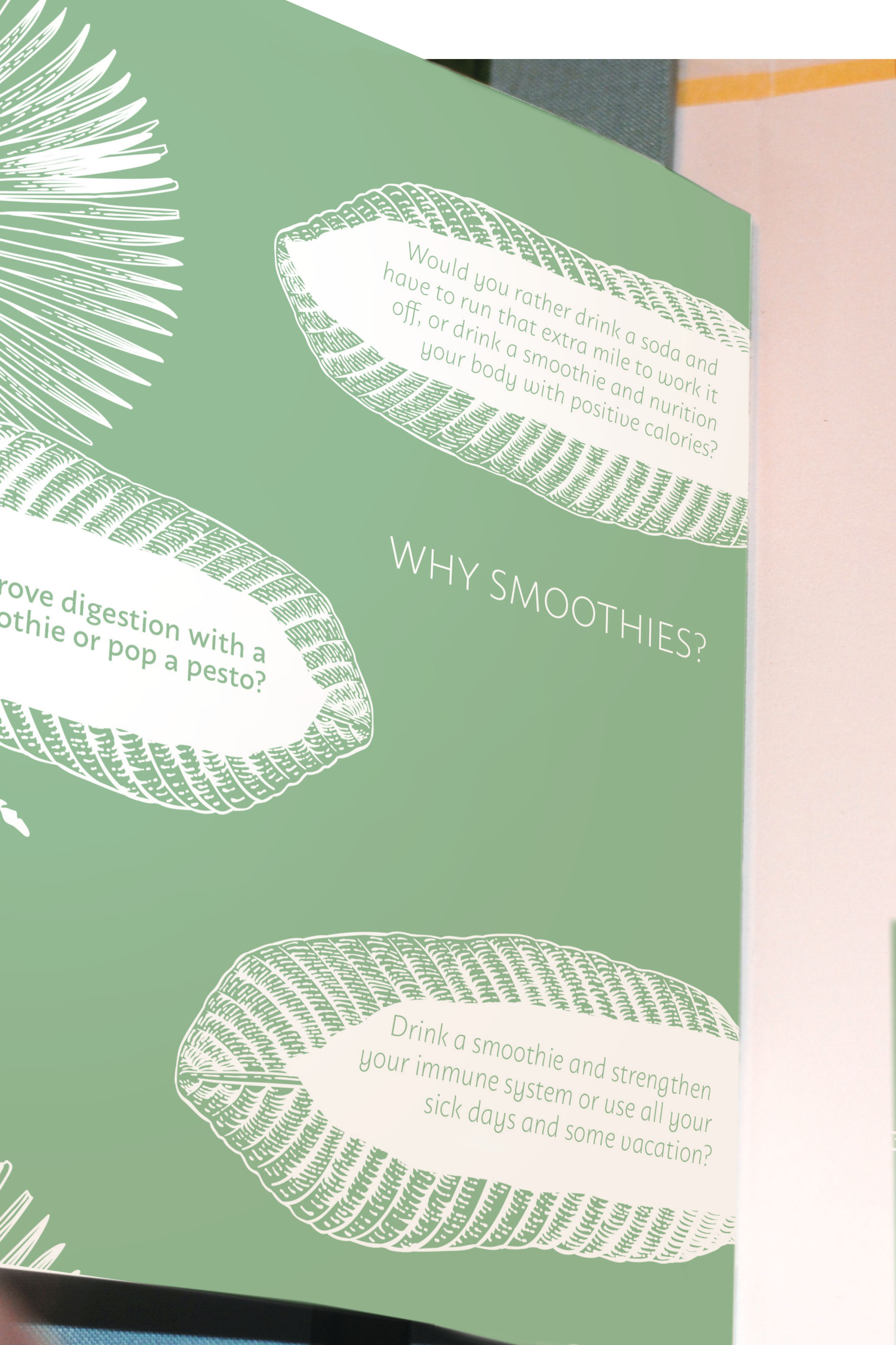
With the concept in mind and the requirement of a cookbook, the idea of a membership welcome packet was born. Conceptually, the cookbook had everything a new member of the non-exclusive tropics country club would need. Along with the recipes to create the dishes at home, conceptual pages were designed for the concept including fictional activities to dress code and even an unofficial membership card. For the menu, the feel of exclusivity was necessary to theme, so it contained various handouts a member would be likely to receive from the club while sharing the items on the menu with the guests.

 
Open_menu_with cover.jpg
Open_1.jpg
smoothieback.jpg
Halfwayopen.jpg
Coasters_01.jpg
environmental2.jpg
cookbook1.jpg
cookbookgroup.jpg
memberscard.jpg
hero_storefront_.jpg
 

Campaign Promoting a Healthy Marriage

Between fifty-two percent and fifty-six percent of first marriages end in divorce before the first twenty years. To assist with the hopes of decreasing the astonishing divorce rate in the United States a campaign was established to promote developing and rekindling a healthy relationship. The aim was to connect with the target audience of 35-55 year od age married men due to the statistic that this age group tended to be less likely to initiate counseling or notice a rise in conflict within a marriage and many men this age would be close to reaching 10 plus years of marriage mark. The focus was to put their relationship in perspective and encourage them to take a look at aspects of their marriage that may need to be revived. 

The campaign understood it’s easy to get too comfortable within a relationship and forget about the relationship itself. Schedules and the day-to-day can make matters hectic. It aided in not letting the audience become stagnant but bring back the honeymoon phase. To encourage communication and connect with the audience, the idea of the physical relationship of a marriage, which in many cases is one of the last things to go south, was used as the thematic focus of the campaign. This theme was used throughout the deliverables, from the takeaway item referencing a bedtime couples kit that contained the idea of sexual lubricant and male enhancement pills but physically shared knowledge on loosening the tension in a relationship and ways to show affection on a day to day basis. The polished campaign was achieved by coordinating the visual idea of the physical side of a relationship along with phrases and trigger words that are associated with sexual acts, creating consumer interest with the information referring to tips and advice of the social issue.

 
whole.jpg
lube_1.jpg
sequence4.jpg
News_1.jpg
pills_1.jpg
sequence12.jpg
Subway Advertisments1.jpg
 

Luxury Creede, Colorado Resort Rooted in History

Located in the heart of the rocky mountains lies a small town with a gold mine history. With numerous historic gold mills and mines in the area and breathtaking scenery, it was an ideal location for a getaway resort. Commodore is a renovated 120-year-old mine mill, located in Creede, Colorado. The five-star hotel features historic underground shafts transformed into a guest lounge and bar. The ground also features a spa with natural hot springs and many other luxurious amenities. 

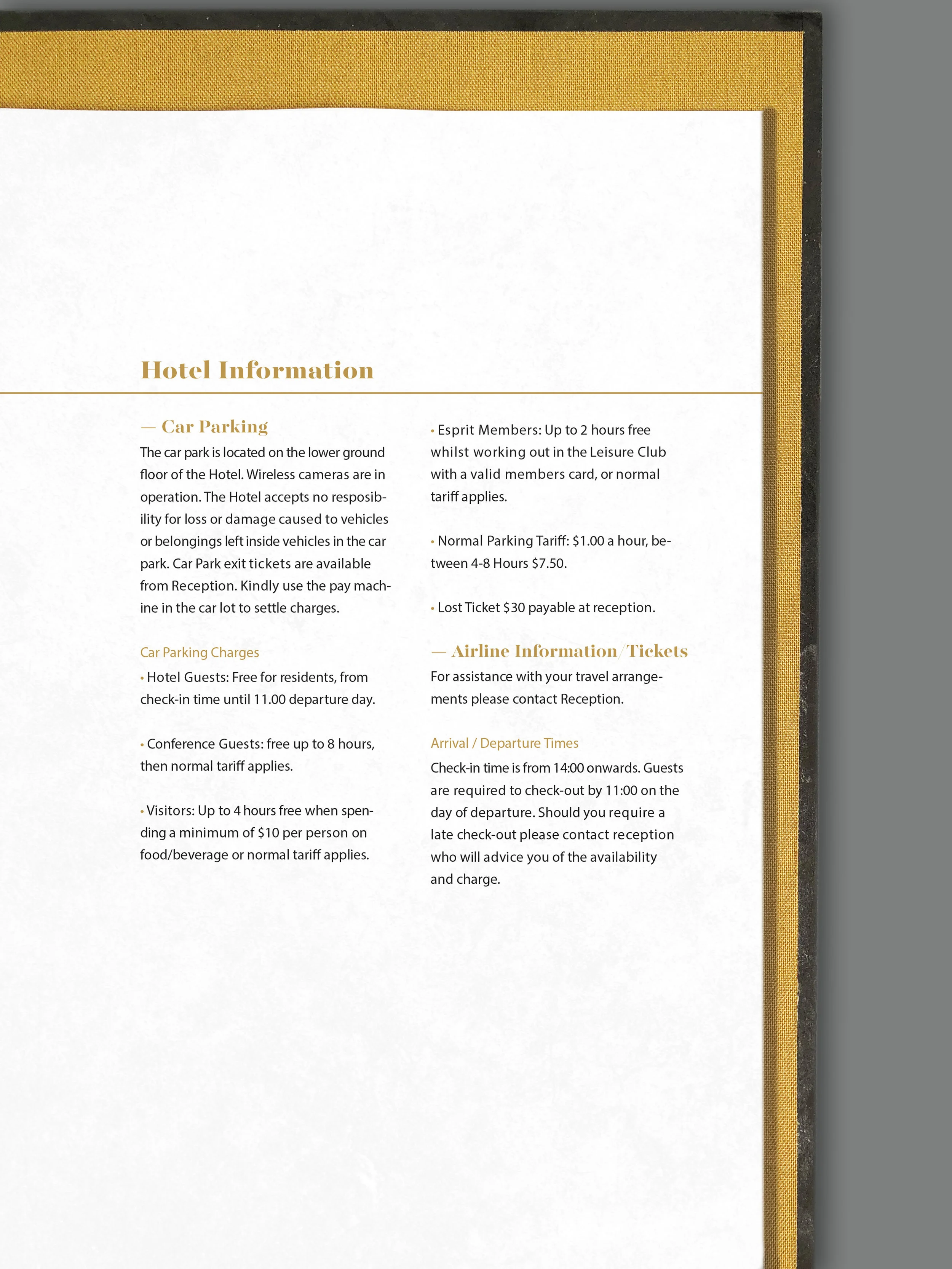
For the resort, a brand logo system was created along with a separate logo system for the resorts on-site lounge and bar. A complimentary guest toiletry set, guest services binder and website were also developed. 

To visually express the rich history of the property while maintaining an elegant luxurious aesthetic a minimal color palette along with gold veins (flakes of gold the run through rocks and quarts) were used. For the guest booklet, that is located within each room, monochromatic photography of the present and prior renovation property were used. The typography mimicked the movement of the gold veins with letterforms stems and legs being slightly distorted. The toiletry set remained relatively simple with the adjustment of the shape of the bottles taking on the visual of gold bars. 

For the separate resort lounge and bar, The Shaft, took on its own identity. Focusing on the other minerals that could be found inside the mine other than gold. 


Room Guest Services Binder

first open spread.jpg
Endsheet.jpg
closeup.jpg
closeup_1.jpg
Closedbooklet.jpg
commodorebooklet.jpg

The Shaft Resort Lounge Branding

Shaf_environmental.jpg
menu.jpg
closeup_menu.jpg

Toiletry Set & Website

IMG_0482.jpg
IMG_0466.jpg
Commodore_portfolio prep-03.jpg
Hero.jpg
 

See Your Insecurities as Empowerments

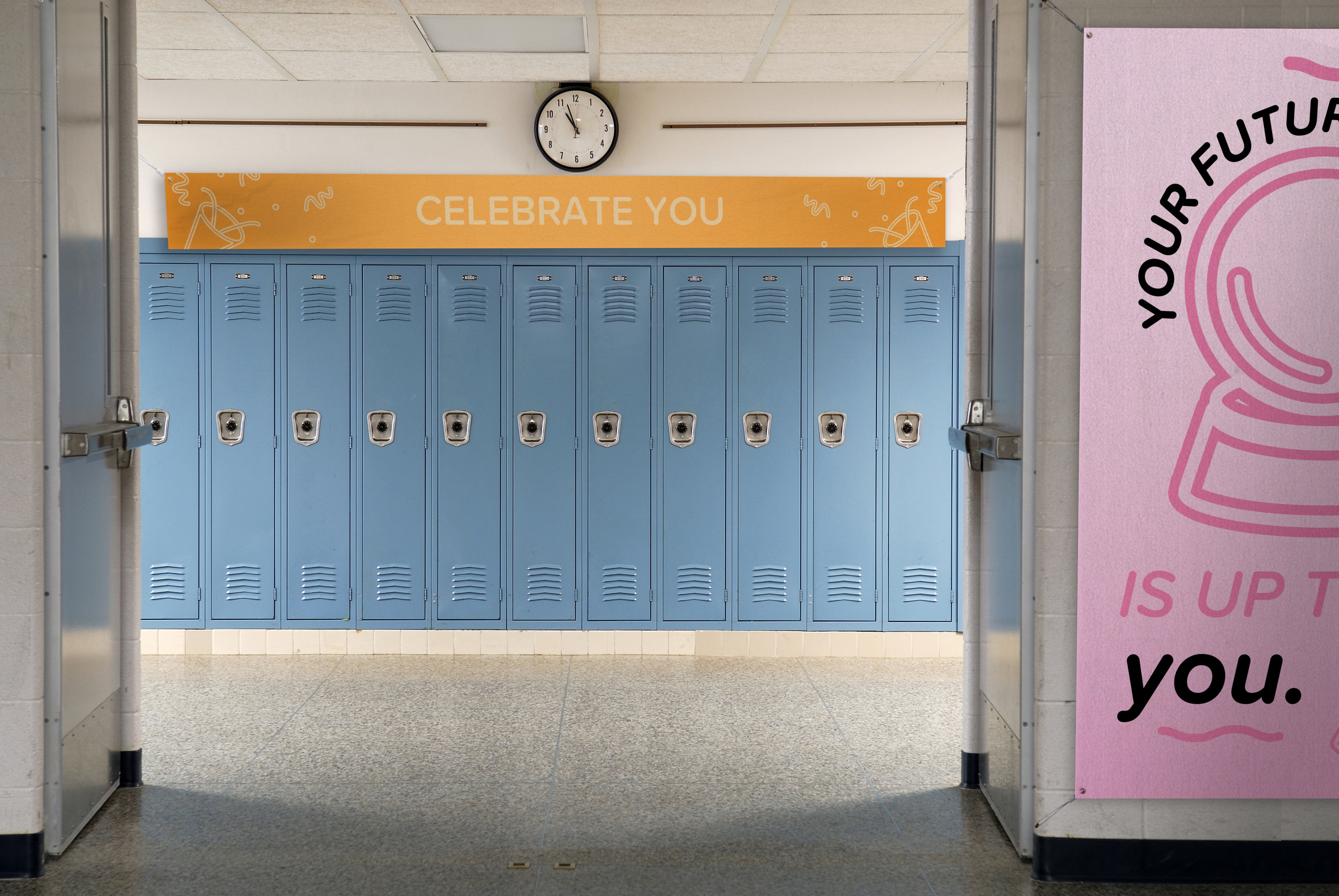
67% of girls age thirteen to seventeen feel insecure (isacs.org). Girls in this age group are going through a lot of physical changes along of the challenges of being a middle or high school student. This campaign goes behind the idea of helping young women become truly content with who they are. To many teenagers are worried about trying to be “that girl they follow on instagram” or a slim size 2, that they lose their personal happiness within themselves. 

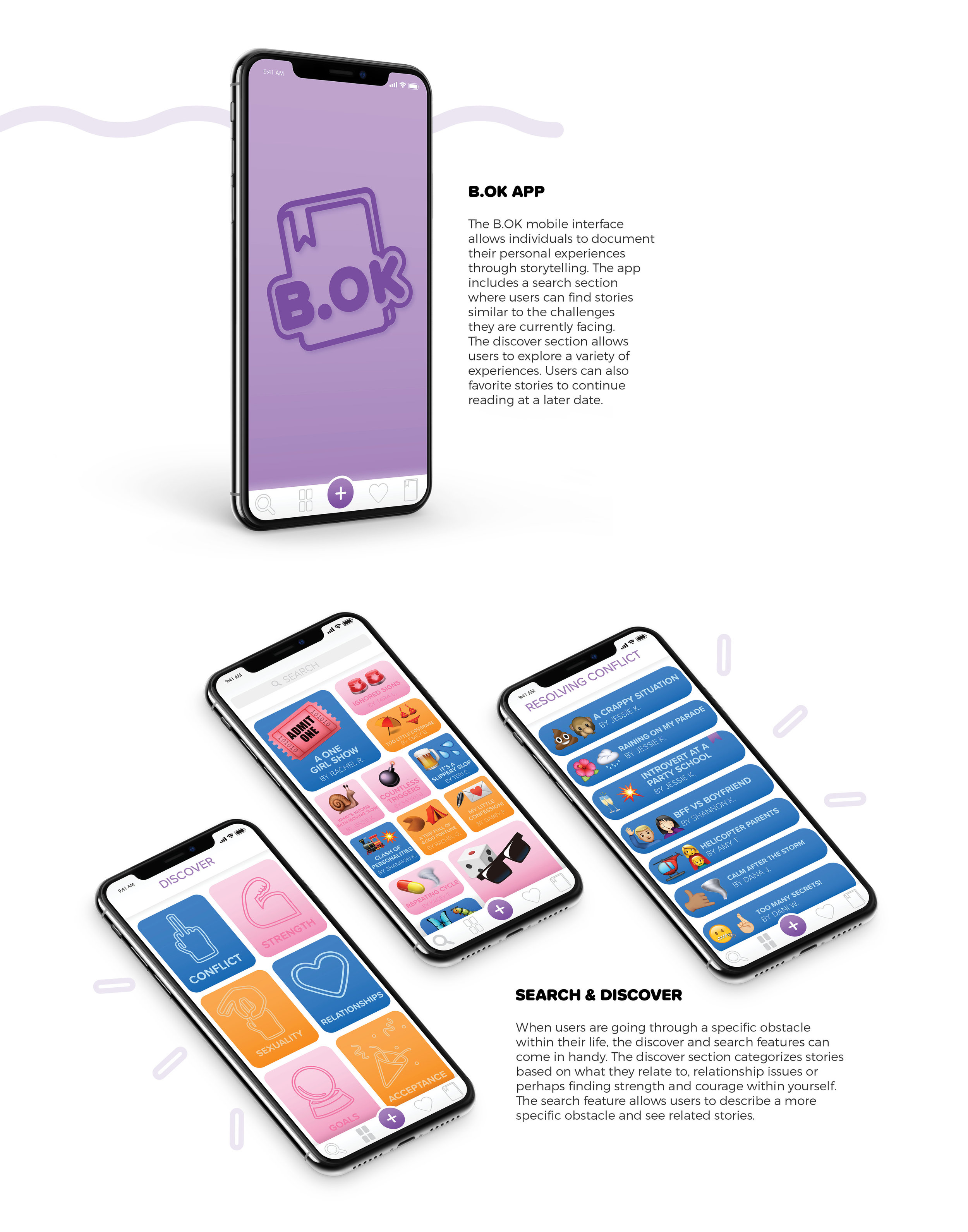
By creating a campaign and interface that promotes sharing your insecurities and upsetting situations, the campaign aims to assist in the younger generation in realizing they are not alone. And that though someone’s life may seem “perfect” on social media, everyone is going through something. To promote the B.OK interface a traveling school to school rally was established along with a interactive handout booklet. 

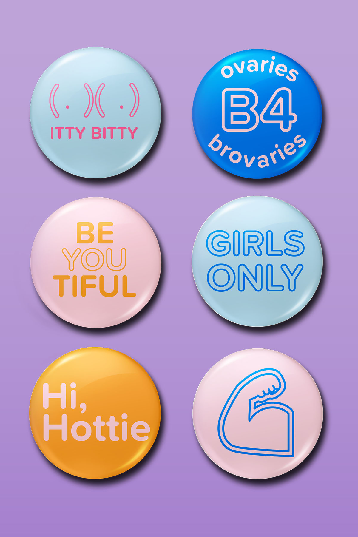
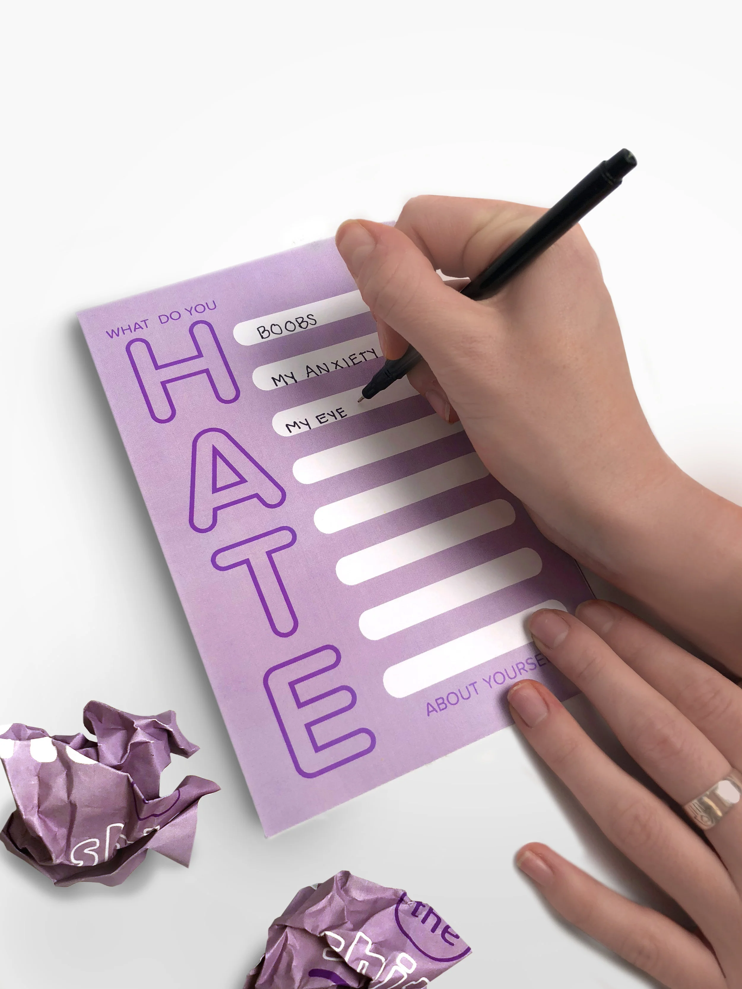
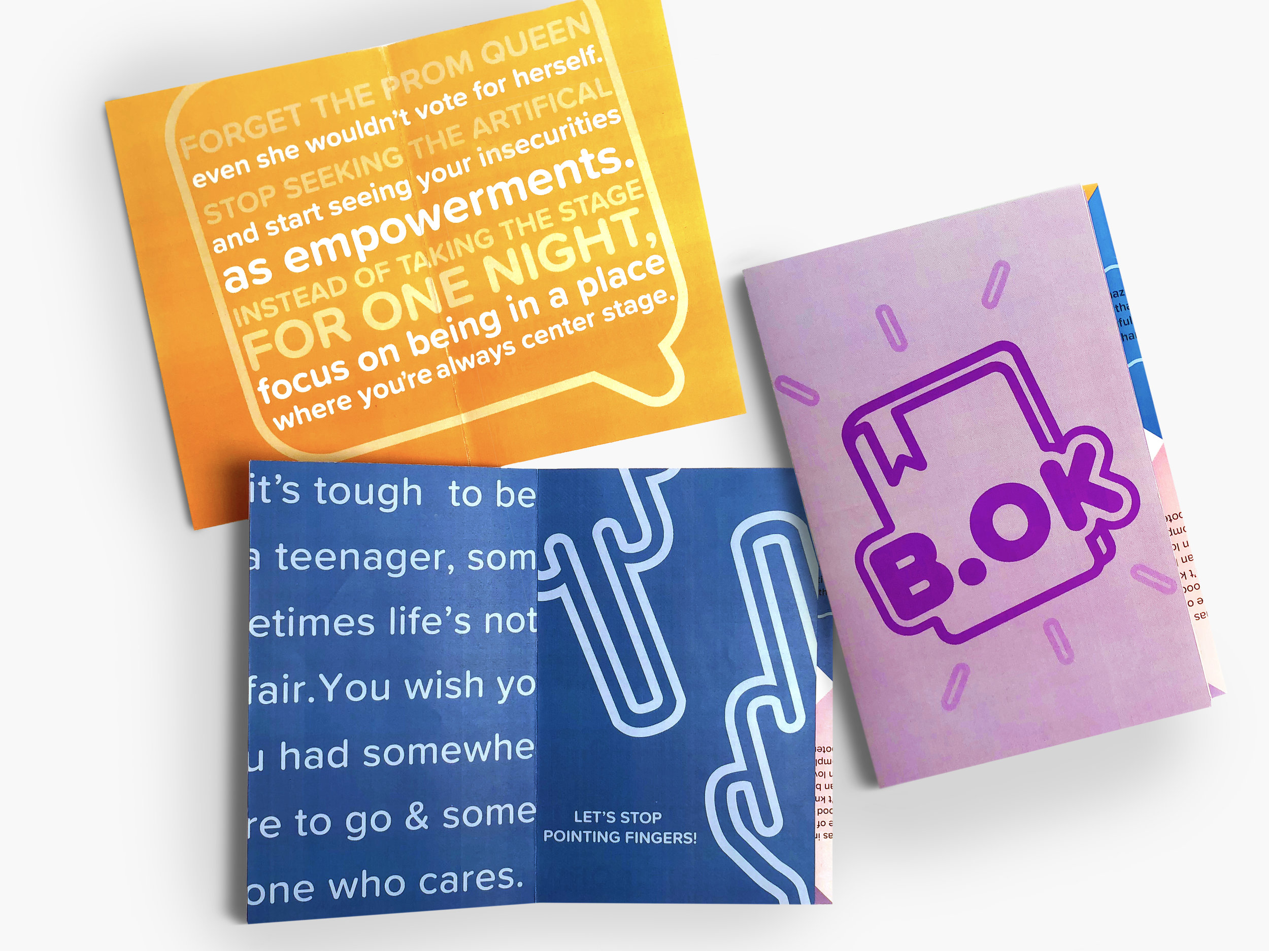
Visually to relate with the target audience of thirteen to seventeen year of age women, icons similar to emoji’s were established along with bold text and a bright color palette. First the campaign encourages individuals to put themselves in the spot light, next the interactive brochure that allows the students to physically write down what they dislike about themselves and rip the page out then create a classic fold-able game that helps the students identify what they do love about themselves. The B.OK  interface shares the same visual style with icons, bold text and colors while still having a focus on the written stories and experiences.


Promotional Material

Environmental3.jpg
Buttons.jpg
environmental1.jpg

Interactive Booklet

ditchit_2.jpg
fortunre_flat.jpg
group1.jpg

App Design

iphone.jpg
iphone2.jpg
Hero_bok.jpg
 

Jörd Travel Brochure

Custom Travel Excursions

Jord is a Swedish based travel company with an emphasis on the unknown and an aim to cater to each adventure personally. To further their specialized travel destinations to the United States a 16-day tour to 6 different cities was created. This trip specialized in sharing with non-united states residences’ America’s pastime, baseball. With a total of seven games, the tour groups are capable of engulfing themselves in an authentic American tradition. 

For the tour brochure, it was important to give the potential customers a preview into the world of baseball, to do so visually the booklet contained the nostalgic feel of baseball over the decades. The book verbal shared each day itineraries’ and some of baseball’s greatest moments. Discussing Babe Ruth and the curse of Bambino, the classic take me out to the ball game song and baseball terminology. The customers also received maps of each stop on the trip and on the reverse side received a baseball score sheet adapted to not only keep score but allow the clients to record memories of the days in that specific city.

 
Whole.jpg
open case.jpg
Maps_1-05.jpg
Cover spread 2.jpg
spreads3-4.jpg
spread9-10.jpg
closeup1.jpg
closeup6.jpg
Whole.jpg
philippe1.jpg
 

Sequence: Board Game Redesign

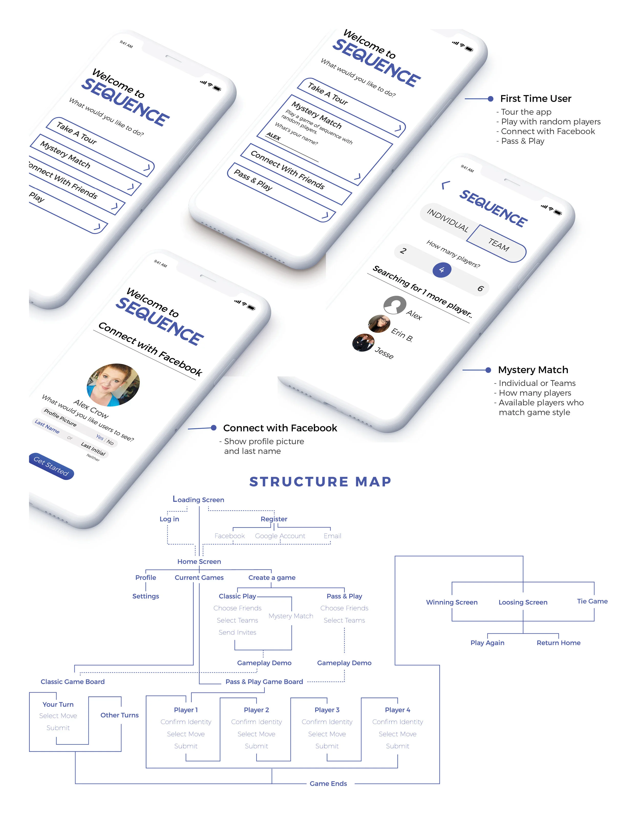
The Sequence App translated a visually-dense board game to a mobile environment while keeping the traditional-style of an analog game. The purpose of the adaptation was to allow for entertaining in a multi-media format while focusing on keeping the game play instinctive and user-friendly. The desired destination was to simplify the mobile game to translate the board to a small screen and address multiple devices and play modes (i.e. teams, single player, pass and play, random). 

To keep with the sleek remodel of the sequence board, the user interface was kept fairly simple allowing functionality to be the focus. To allow the multi-media format of Sequence to still relate to the physical analog game, the primary color blue was used along with white which complimented the physical box of the game. The Adapted Sequence game to a mobile interface provided the convince of on the go entertainment along with friendly competition.

 
sequence3.jpg
sequence4.jpg
sequence12.jpg
Sequence_heroshot_1.jpg
 

Identity & Multi-platform Design for Solcharge

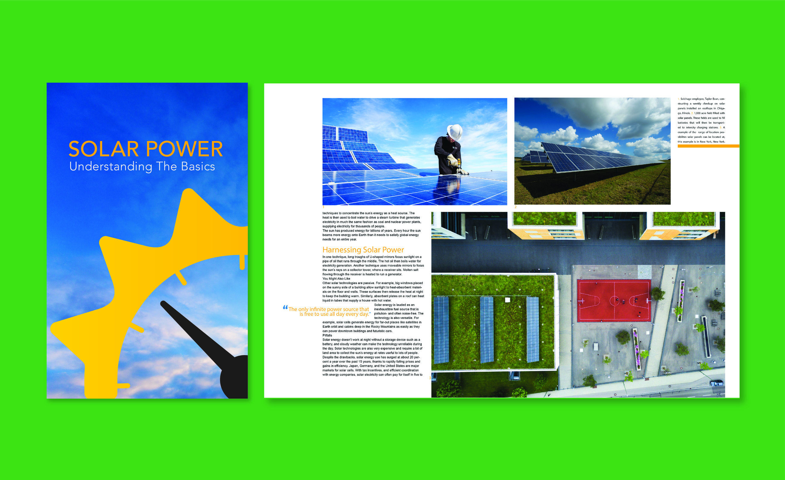
With the rise in electric vehicles, the demand for charging stations grew. This need led to the development of a solar-powered electric car charging station’s visual identity and branding. Solar power is 100% clean, renewable energy that can power your electric vehicle and can be more cost efficient than gas per gallon and charge through electricity from utility companies. 


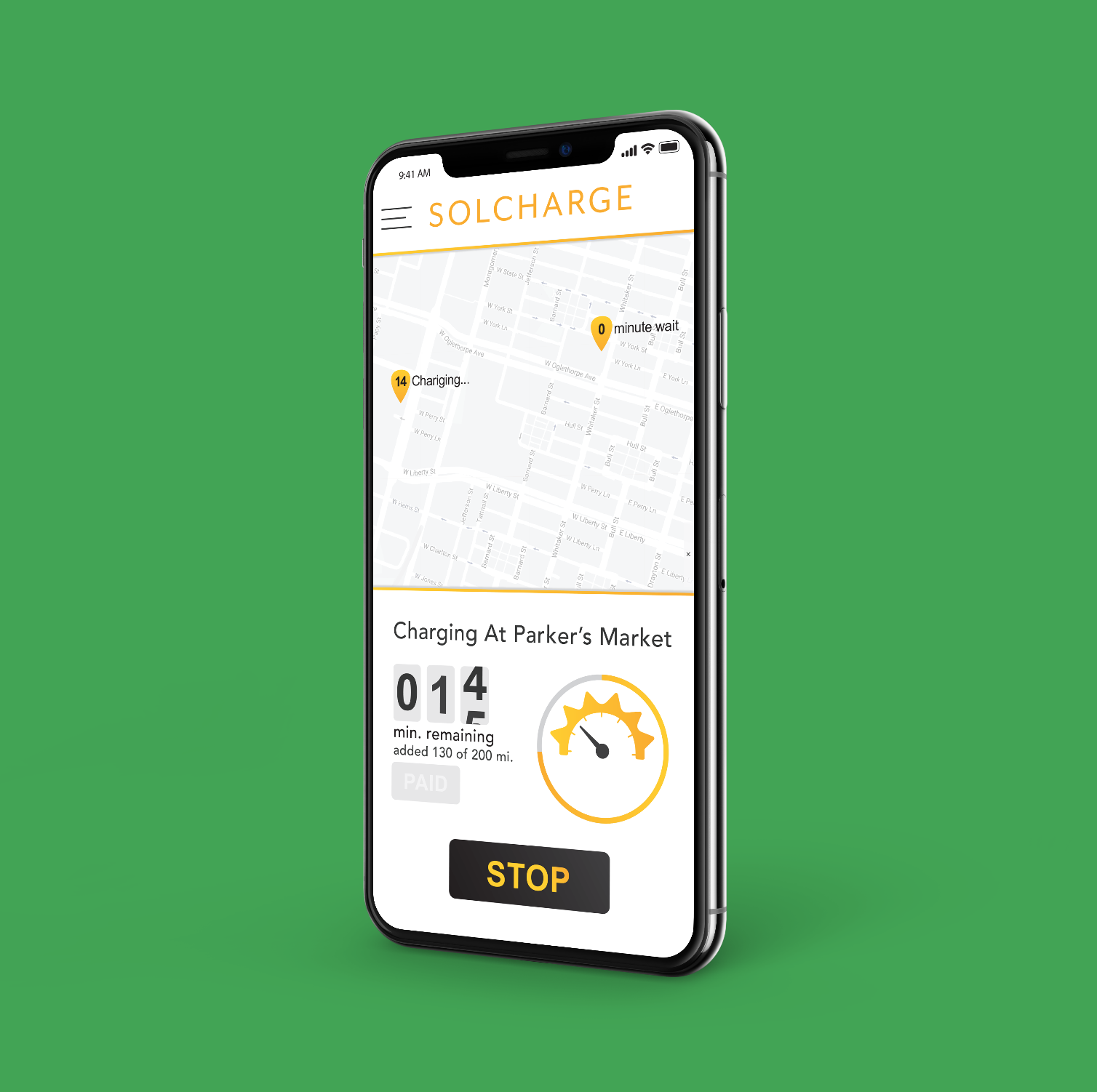
The development of the brand identity began with research of the industry and common visuals that relate to solar, vehicles and eco-friendly. From there came the creation of the brand’s trademark that visually referenced the idea of solar power and motor vehicles. This was done by integrating the optical idea of a sun with a gas gauge. The finished trademark became widely and quickly understandable by taking the familiar circle of a gas gauge’s outer curve and mimic the visual interpretation of rays from the sun. From there the name “Solcharge” was developed by conjoining Sol, to reference the solar power, and Charge, referencing the vehicle charging. 

 
Solar_Portfolio Prep-01.jpg
billboard3.jpg
Solar_Portfolio Prep-03.jpg
Solar_Portfolio Prep-04.jpg
billboard row.jpg
 

After the development of Solcharge’s trademark and logotype, came the production of the spoken and written tone. To assist the consumers in understanding Solcharge and increasing brand awareness, terminology that described and complemented the idea of the sun was used throughout advertising and branding materials. For the visual style of the advertising and branding materials the same concept was used, of increasing brand awareness by using complimentary items of the sun, these visuals included sky imagery during all times of day and night along with juxtaposing the trademark into the horizon line of an image. By replacing the visual of the sun with the Solcharge trademark, the brand became the focal point.

 
Enviromental graphics.jpg